- Home
- About Me
- Buy My Music
- Composer's Secret Weapon
- Links
- Contact
-
Blog
-
Articles
- Everything In Its Right Place
- a tempo vs. Tempo I
- Placing Fermatas over Whole Rests
- Introduction to Linked Parts
- Transpose Percussion Notes
- Learn As Much As You Can...
- A Place for Everything, and Everything In Its Place
- Combined Staff in Score --> Separate Parts
- Tritone and P4ths
- Large and In Charge
- JW Copy Part Layout
-
Articles
|
Finale is fantastic in many, many ways. I'm sure the other notation programs are also great, I have just never used them. I've been with Finale since v.3.0 and have no interest in starting over with a new program...this one keeps me on my toes as it is! I am continually learning new things about the program and tips and tricks to improve workflow and layout.
One of the biggest complaints about Finale, however, is the default settings for most of the elements of both design and layout. Fortunately, nearly every possible detail is customizable to suit your taste & preference. This ability to change most settings enables anyone to quickly improve the layout of their scores and parts, but it also makes it very easy to tell when a user is inexperienced, or unaware of professional standards. Everyone who owns Finale thinks that it automatically makes them a copyist/engraver. No, it doesn't. The attention to detail and obsession over the tiniest elements is what separates the best from the rest. Here are a few tips to get you started in your journey towards better looking parts. 1. Adjust the Left & Right Margins
Finale's default settings for left and right margins are 0.5 inches; that's too narrow. Reset then to 0.75 inches. There. Doesn't that feel better? Elaine Gould agrees, too.
2. Managing Page & Staff Sizes
This is a BIG one that is easy to mess up. For YEARS my parts were all weird because instead of learning how to do it right, I went rogue and ended up "trial and error-ing" all over the place and ended up with some pretty bizarre results.
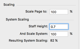
Go to Document -> Page Format -> Parts 1. Set the Page Size to 9x12 inches. Even if you are planning on printing on 8.5x11, just set it to 9x12 for now. 2. Scaling: Scale Page to: 100% (if you set it smaller than this, it not only reduces the staff size, but also everything else, including the title and composer, and all other text, too. You don't want this. 3. Set Staff Height to 0.7 cm. and Scale System to 100% (which will make the resulting system scaling 82%) Now, go back and Update Layout and you should be very happy with how things look. When it comes time to print, if you are forced to print on 8.5x11, just select "letter" from the print dialog and check "scale to fit page" or "fit to page" and it will automatically make the perfect adjustments to print on 8.5x11, maintaining the perfect ratios and proportions created in the 9x12 formatting. 3. Take it Easy with the Fonts
Nothing screams "I DON'T TAKE MYSELF SERIOUSLY AND NEITHER SHOULD YOU" quite like the misuse of fonts, especially once they get too "cutesy." I am not saying that you should not change the default fonts (in fact, I think in many cases you SHOULD change the default fonts) but I'm just suggesting that you use discretion when doing so. Use music fonts for dynamics that match the music font you are using for music.
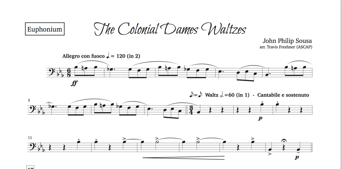
If you are going to use different text fonts for title, composer, text expressions, instrument names, etc., be sure that they complement each other (work well together) and that they also complement the music font being used, and the style. Just because you really like a certain font doesn't mean that it is appropriate in every situation. This example is about as crazy as I get with Title fonts. This is an extreme case, as I rarely go this far away from a more standard look, but I did want to give an example of where I think it would be appropriate. Notice how it isn't over done...it's only the title. I would not recommend using a font like this for anything else other than just the title. Everything else is in a clean, classy serif font (I won't tell you which one, though....I can't give away all of my secrets).
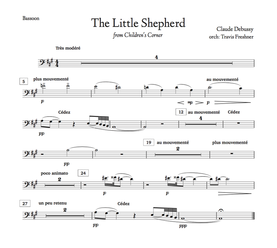
Here is my much more standard look. But still, notice how the title font reflects the style/era/composer/time period of the piece. But in a much more subtle way.
By simply applying these three principals, your parts will instantly look more professional and you will make a much better first impression on your client, players, or whomever reads your music. As you continue to progress, you will find even more little tweaks here and there to cultivate your own personal house style. But if you have bee using all of the default settings, these three tips alone will give you a serious boost not only in appearance, but also credibility.
Mailing List
If you like what you read today, please be sure to sign up for our monthly mailing list, so you will always be up to date on what's new and what's going down. I promise not to waste your time and fill your inbox with junk. Just one email every 4-5 weeks and it will be full of great (or at least useful) content.
5 Comments
|
Archives
April 2018
Categories
All
|


 RSS Feed