- Home
- About Me
- Buy My Music
- Composer's Secret Weapon
- Links
- Contact
-
Blog
-
Articles
- Everything In Its Right Place
- a tempo vs. Tempo I
- Placing Fermatas over Whole Rests
- Introduction to Linked Parts
- Transpose Percussion Notes
- Learn As Much As You Can...
- A Place for Everything, and Everything In Its Place
- Combined Staff in Score --> Separate Parts
- Tritone and P4ths
- Large and In Charge
- JW Copy Part Layout
-
Articles
The style and location of different types of text markings, such as tempo markings, expressions and technical instructions, is one of the more recent conventions to be standardized. If you look through several different music notation manuals, this is the area where you will find the most obvious differences and discrepancies from one text to another. I think this is caused by a combination of factors, but mostly from a lack of standardization at the time of their publication.
In this article, I am going o share with you the way that I do it, which is also the way outlined in Elaine Gould's "Behind Bars."
Some might say "Who cares? Notation isn't music. Players are smart enough to figure out what I mean. And besides, Beethoven did X like this, so it seems like he'd know better, right? Or are you saying that Beethoven a crappy composer?" If you are one of the people who are saying this, then I'm wondering why you are even reading this article in the first place. Stop it.
Here's my stance:
Having a specific location and style for each kind of element makes it easier and quicker for the conductor and performers to identify markings. When they see them, they immediately know how the marking is going the affect the music before even processing exactly what it says. It reduces the likelihood of mistakes because the players are less likely to miss a marking.
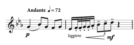
Here it is, in a nutshell.
Tempo markings are in bold.
Expressive markings are in italics.
Technical instructions are in plain Roman type.
Established Tempos
Established tempos should be bold roman type and capitalized. They should be aligned with the beginning of the time signature, if available, or with the first notation element in the measure (note, accidental, etc). A metronome marking may be given alone as a tempo indication, but it is generally preferred to be presented in cooperation with a descriptive marking.
Tempo Alteration Markings
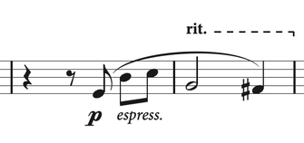
Temporary tempo alterations, such as ritardando and accelerando, should also be in bold roman type, but are not capitalized. They should be placed above the top staff in the system and have a dashed line connecting it to the next established tempo. You may see these italicized in older publications, but this is no longer how they are labeled.
If the new tempo is a direct result of the tempo alteration (rit. or accel.) then you would use a plain dashed line as shown below.
If the new tempo is a direct result of the tempo alteration (rit. or accel.) then you would use a plain dashed line as shown below.
If the new tempo is NOT a direct result of the tempo alteration, then you would use a dashed line with a notch at the end indicating exactly where the tempo change occurs. Full disclosure: I learned this part about the notch while preparing this post.
Expressive Markings
Markings related to expressive playing styles are given in italics and are usually placed below the staff. However, if things are too crowded below the staff, it is okay to place these above the staff. These are the only markings with that flexibility.
Technical Instructions
Technical markings, such as pizz./arco indications, mute instructions, and other similarly technical instructions are given in lowercase roman type, non-bold. These are placed above the staff.


